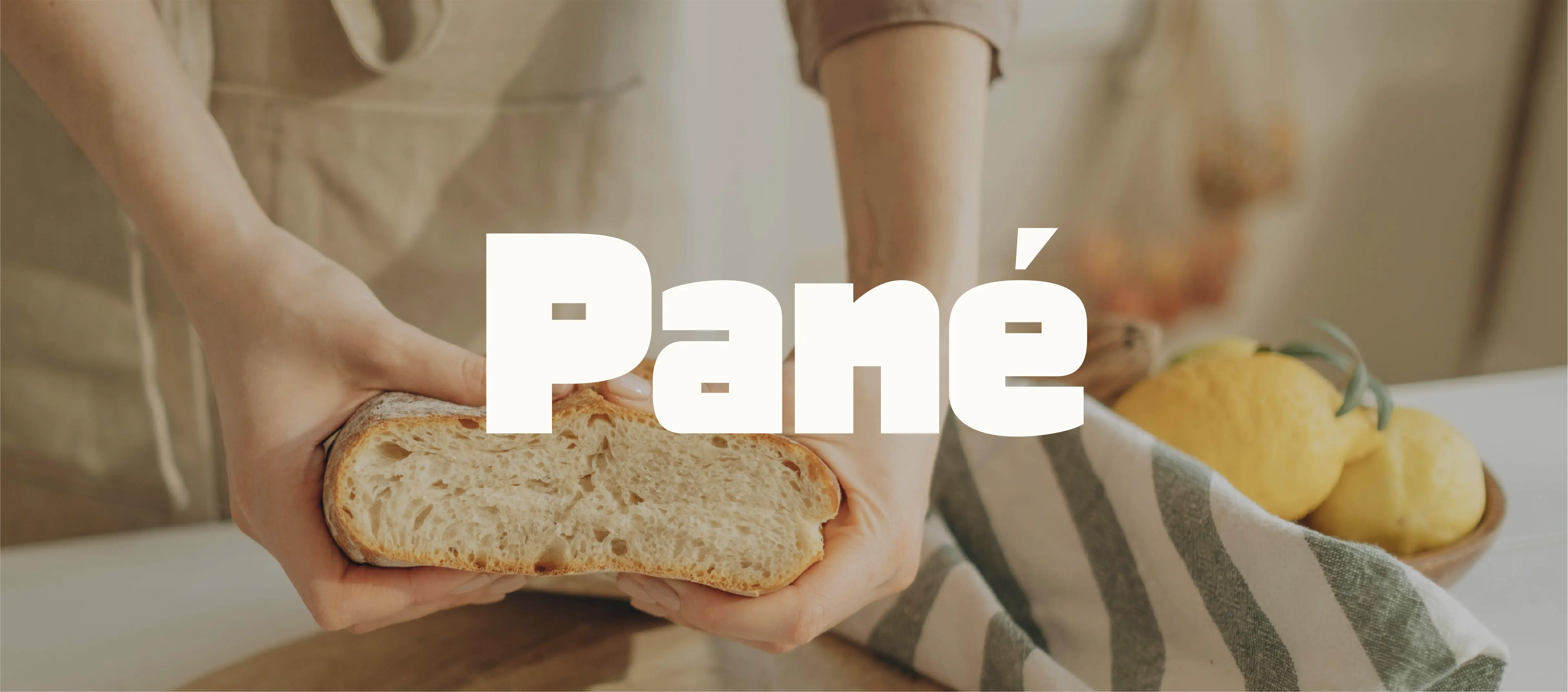
Pané
project overview
we developed a vibrant color system to differentiate products while maintaining a unified brand presence. each tone was chosen to feel fresh and appetizing, reinforcing the product experience through color alone. typography became a central element, bold, slightly playful, and highly legible. it carries the personality of the brand, allowing the design to remain clean while still expressive. the compositions were kept minimal but intentional, balancing negative space with strong visual anchors to create packaging that feels modern, graphic, and easy to recognize at a glance.
project type
Brand Identity
year
2025
my role
Brand designer
client
Pané